
▫️- joellesenne.dev
▫️- mastodon.social/@joellesenne
▫️- github.com/joellese
▫️- codepen.io/joellesenne
cydstumpel.nl/start-using-...

cydstumpel.nl/start-using-...
custom select with CSS (progressively enhanced)
select {
&,
&::picker(select) { appearance: base-select; }
}
custom select with CSS (progressively enhanced)
select {
&,
&::picker(select) { appearance: base-select; }
}
... not as powerful as MacOS implementation but pretty cool
... not as powerful as MacOS implementation but pretty cool

css-tip.com/heart/
I think I just found my new favorite CSS feature. 😍
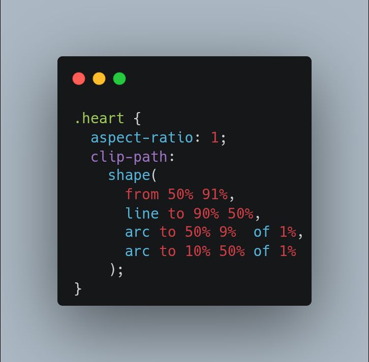

css-tip.com/heart/
I think I just found my new favorite CSS feature. 😍
css-tricks.com/the-lost-css...
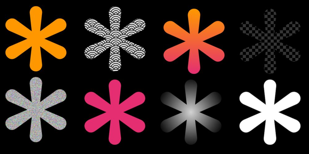
css-tricks.com/the-lost-css...
They are finally possible using only CSS (no SVG and no Canvas)
How? The new shape() function!
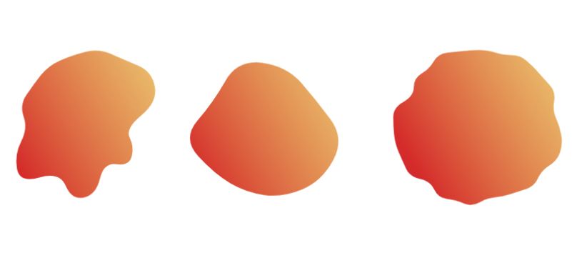
They are finally possible using only CSS (no SVG and no Canvas)
How? The new shape() function!

webkit.org/blog/16587/i...

webkit.org/blog/16587/i...
Idea from codepen.io/gabrielcojea... but:
✨ no JS for scroll-triggered transitions, just a scroll-driven animations trick 🪄
✨ no text duplication for the dynamic headline-image intersection, just a simple #SVG filter
Idea from codepen.io/gabrielcojea... but:
✨ no JS for scroll-triggered transitions, just a scroll-driven animations trick 🪄
✨ no text duplication for the dynamic headline-image intersection, just a simple #SVG filter
```
.container { display: grid }
.stacked-item { grid-area: 1/ 1 }
```
I use it all the time to stack elements.
Stack faces of polyhedra before positioning them in 3D. Stack images. Stack 🥧 slices codepen.io/thebabydino/...
#CSS
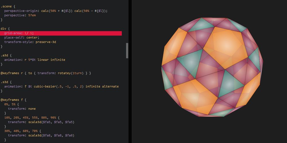

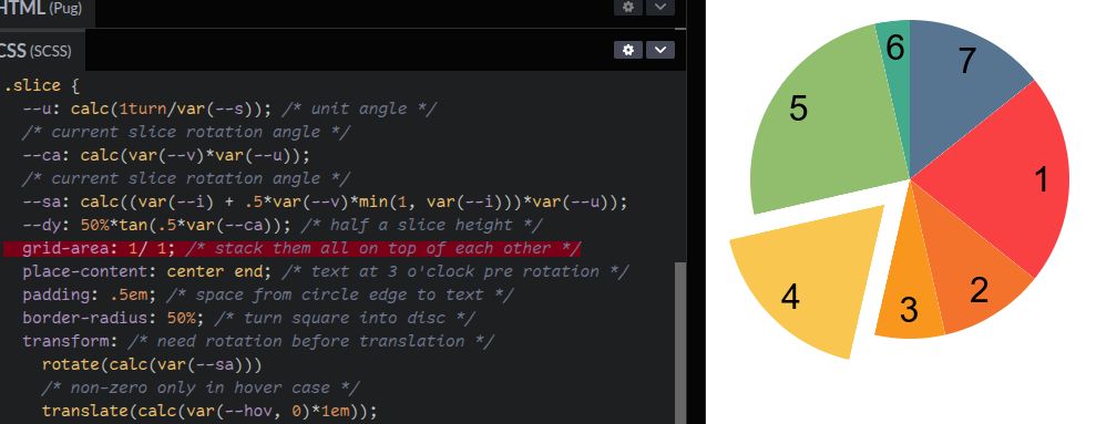
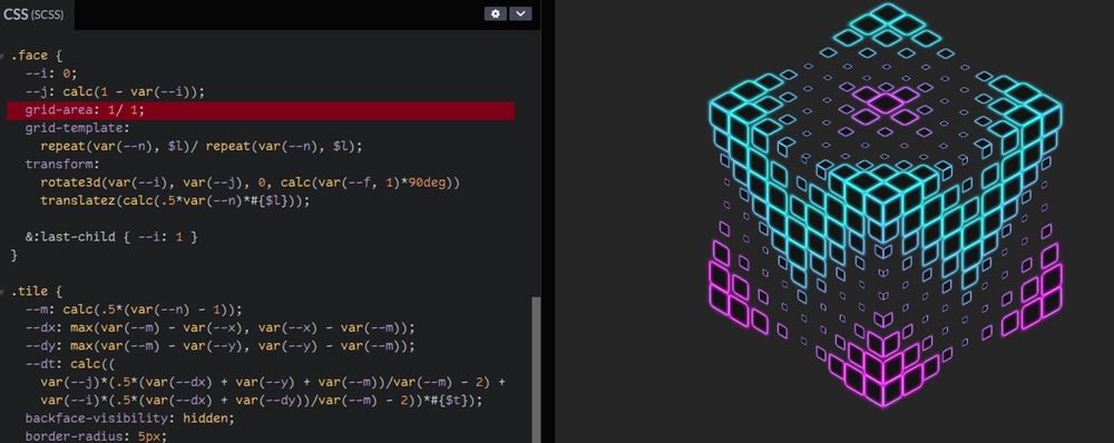
```
.container { display: grid }
.stacked-item { grid-area: 1/ 1 }
```
I use it all the time to stack elements.
Stack faces of polyhedra before positioning them in 3D. Stack images. Stack 🥧 slices codepen.io/thebabydino/...
#CSS
We've saved the most complex for last. This example combines animate, motion values, useSpring and useTransform to create this slide-to-reveal actions UI.
Full source and tutorial: examples.motion.dev/react/swipe-...
We've saved the most complex for last. This example combines animate, motion values, useSpring and useTransform to create this slide-to-reveal actions UI.
Full source and tutorial: examples.motion.dev/react/swipe-...
Do you use #CSS grid? Ever wanted to have separators in between grid areas?
Have you resorted to weird background gradient, box-shadow & more hackarounds to solve this?
Then check out this gap decorations proposal blogs.windows.com/msedgedev/20...

Do you use #CSS grid? Ever wanted to have separators in between grid areas?
Have you resorted to weird background gradient, box-shadow & more hackarounds to solve this?
Then check out this gap decorations proposal blogs.windows.com/msedgedev/20...
css-generators.com/custom-borde...
css-generators.com/custom-borde...
🔥 How function and if() work in CSS
🍞 Navigating breadcrumbs in VS Code
🤔 The difference between :has(:not) & :not(:has)
🦄 Reimagining Fluid Typography
Featuring @bram.us, @mattzeunert.com, @kilianvalkhof.com, @miriam.codes, @ryantrimble.com, @lea.verou.me.
cssw.io/issue-606

🔥 How function and if() work in CSS
🍞 Navigating breadcrumbs in VS Code
🤔 The difference between :has(:not) & :not(:has)
🦄 Reimagining Fluid Typography
Featuring @bram.us, @mattzeunert.com, @kilianvalkhof.com, @miriam.codes, @ryantrimble.com, @lea.verou.me.
cssw.io/issue-606
available Chrome Canary with experiments enabled!
`transition-delay: calc(sibling-index() * .1s);`
or
```css
--hue: calc(sibling-index() * 50);
color: oklch(70% 70% var(--hue));
```
more info and a Codepen to fork
⤷ https://nerdy.dev/sibling-index
available Chrome Canary with experiments enabled!
`transition-delay: calc(sibling-index() * .1s);`
or
```css
--hue: calc(sibling-index() * 50);
color: oklch(70% 70% var(--hue));
```
more info and a Codepen to fork
⤷ https://nerdy.dev/sibling-index
This time, I am using scroll-driven animation to create the star rating component! It's a good exercise to discover some modern features.
css-tricks.com/a-css-only-s... via @css-tricks.com
Single element and 100% CSS magic!
This time, I am using scroll-driven animation to create the star rating component! It's a good exercise to discover some modern features.
css-tricks.com/a-css-only-s... via @css-tricks.com
Single element and 100% CSS magic!
One property and two gradients to add a transparent inner border to image elements.
css-tip.com/inner-border/


One property and two gradients to add a transparent inner border to image elements.
css-tip.com/inner-border/


