


chris willmore
@cwillmore.bsky.social
type west '24 • treedub.org
Reposted by chris willmore
Pokemon is basically a thing Nintendo does where once every couple of years they release a new set of character designs and I get to enjoy cute fanart based on these character designs for the next two years. Allegedly, a video game is somehow involved somewhere
November 7, 2025 at 12:15 AM
Pokemon is basically a thing Nintendo does where once every couple of years they release a new set of character designs and I get to enjoy cute fanart based on these character designs for the next two years. Allegedly, a video game is somehow involved somewhere
Reposted by chris willmore

January 16, 2025 at 8:28 AM
Reposted by chris willmore

we're so back. youtu.be/aDl3cwrpz_U?...

Erik Hall - "Music for a Large Ensemble" (Steve Reich)
YouTube video by westernvinyl
youtu.be
November 4, 2025 at 6:31 PM
we're so back. youtu.be/aDl3cwrpz_U?...
all the A's i drew for #fontober 2025 (and an accurate representation of my mental state afterwards lol). which one was your favorite?
big thanks to everyone who followed along and provided feedback and encouragement ❤️ let's do it again next year!
big thanks to everyone who followed along and provided feedback and encouragement ❤️ let's do it again next year!

November 2, 2025 at 5:37 AM
all the A's i drew for #fontober 2025 (and an accurate representation of my mental state afterwards lol). which one was your favorite?
big thanks to everyone who followed along and provided feedback and encouragement ❤️ let's do it again next year!
big thanks to everyone who followed along and provided feedback and encouragement ❤️ let's do it again next year!
#fontober day 31 (LAST DAY 🎃): i had zero inspiration this morning so i just made a lowercase to complement the uppercase from yesterday. i like how i was able to reuse the weird serif from C in a/c/r/s. it feels like the headline from an old-timey railroad timetable or almanac


October 31, 2025 at 8:21 PM
#fontober day 31 (LAST DAY 🎃): i had zero inspiration this morning so i just made a lowercase to complement the uppercase from yesterday. i like how i was able to reuse the weird serif from C in a/c/r/s. it feels like the headline from an old-timey railroad timetable or almanac
#fontober day 30: the redlick-newman building by 17th and mission in SF (the one that used to have the "17 reasons why!" sign on top) has these blocky geometric letters embedded in the sidewalk out front. i had to fontify them. why is the original N so narrow tho? did they forget about the hyphen?


October 30, 2025 at 7:37 PM
#fontober day 30: the redlick-newman building by 17th and mission in SF (the one that used to have the "17 reasons why!" sign on top) has these blocky geometric letters embedded in the sidewalk out front. i had to fontify them. why is the original N so narrow tho? did they forget about the hyphen?
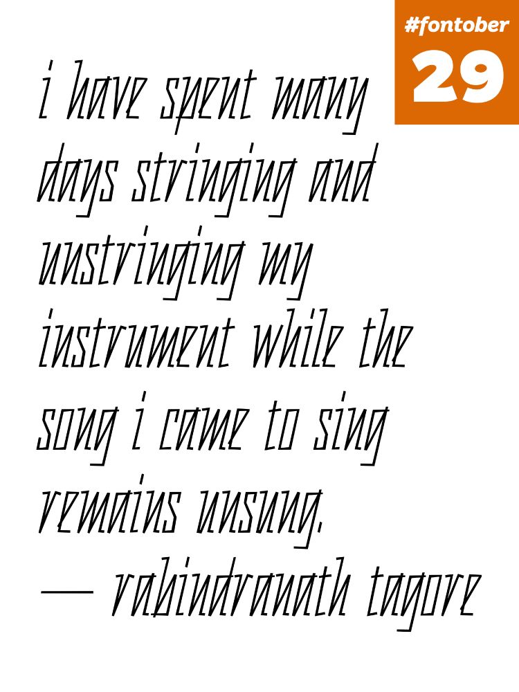
#fontober day 29: my handwriting tends to take a zig-zag form for letters like i/m/n/u (good thing no one else has to read it!) so i made an irregular monolinear italic with a zig-zag rhythm. i was tempted to make 'n' and 'u' identical but i'm not that mean — how would you tell "month" from "mouth"?


October 29, 2025 at 11:35 PM
#fontober day 29: my handwriting tends to take a zig-zag form for letters like i/m/n/u (good thing no one else has to read it!) so i made an irregular monolinear italic with a zig-zag rhythm. i was tempted to make 'n' and 'u' identical but i'm not that mean — how would you tell "month" from "mouth"?
Reposted by chris willmore


#fontober day 28: the font in the first image is plain old Times, just upside down, right? now look at the second image where i turn it right side up. wtf!! (1/5)


October 28, 2025 at 8:28 PM
#fontober day 28: the font in the first image is plain old Times, just upside down, right? now look at the second image where i turn it right side up. wtf!! (1/5)
#fontober day 27: finished the ink traps experiment from yesterday. the traps force some tough decisions — the R has one corner in the crotch because having two traps that close together is too complex. i wish i had more control over which direction they pointed so R/X could look a little less wonky


October 27, 2025 at 6:50 PM
#fontober day 27: finished the ink traps experiment from yesterday. the traps force some tough decisions — the R has one corner in the crotch because having two traps that close together is too complex. i wish i had more control over which direction they pointed so R/X could look a little less wonky
#fontober day 26: does it count as a whole alphabet if i draw half of an alphabet in two masters? i think so lol. here i'm using @glyphsapp.com corner components to add variable ink traps to a bold italic sans. i like how the S looks like a slug. gonna try to finish this one tomorrow


October 26, 2025 at 7:22 PM
#fontober day 26: does it count as a whole alphabet if i draw half of an alphabet in two masters? i think so lol. here i'm using @glyphsapp.com corner components to add variable ink traps to a bold italic sans. i like how the S looks like a slug. gonna try to finish this one tomorrow
#fontober day 25: designed a narrow lowercase sans with some contrast for the 16-pixel-tall displays over the doors at the ends of the BART car (see image 3). pixel fonts are so hard — there are only a few slopes that look good on a pixel grid so making a satisfactory k/v/w/x/y/z is near impossible


October 26, 2025 at 2:24 AM
#fontober day 25: designed a narrow lowercase sans with some contrast for the 16-pixel-tall displays over the doors at the ends of the BART car (see image 3). pixel fonts are so hard — there are only a few slopes that look good on a pixel grid so making a satisfactory k/v/w/x/y/z is near impossible
#fontober day 24: i adore super-high-contrast expansion faces like bodoni black so here's my love letter(s) to them — big ol' ball terminals, hairline serifs, all the f-ligatures. good for book covers and headlines


October 24, 2025 at 10:06 PM
#fontober day 24: i adore super-high-contrast expansion faces like bodoni black so here's my love letter(s) to them — big ol' ball terminals, hairline serifs, all the f-ligatures. good for book covers and headlines
Reposted by chris willmore
Street cleaner fam, assemble! Have some cool announcement on the way!!


October 23, 2025 at 8:06 PM
Street cleaner fam, assemble! Have some cool announcement on the way!!
#fontober day 23: finished the engraver's script from yesterday (for now anyway). uppercase script is hard, but surprisingly modular — spot the shared elements between B/K/R, T/F, A/C/E/G, O/V/W, G/J/Y, Q/Z. surprisingly O and Q have completely separate designs due to the direction they're drawn in


October 23, 2025 at 8:01 PM
#fontober day 23: finished the engraver's script from yesterday (for now anyway). uppercase script is hard, but surprisingly modular — spot the shared elements between B/K/R, T/F, A/C/E/G, O/V/W, G/J/Y, Q/Z. surprisingly O and Q have completely separate designs due to the direction they're drawn in
#fontober day 22: @warriorchicken.me requested a font related to "brass music and trumpets" for her bday so i thought of the way the trumpet maker's name is engraved on the bell sometimes, all ornate and swooshy. might finish this one tomorrow. thanks to lttrink.com for the assist with the strokes!


October 22, 2025 at 9:13 PM
#fontober day 22: @warriorchicken.me requested a font related to "brass music and trumpets" for her bday so i thought of the way the trumpet maker's name is engraved on the bell sometimes, all ornate and swooshy. might finish this one tomorrow. thanks to lttrink.com for the assist with the strokes!
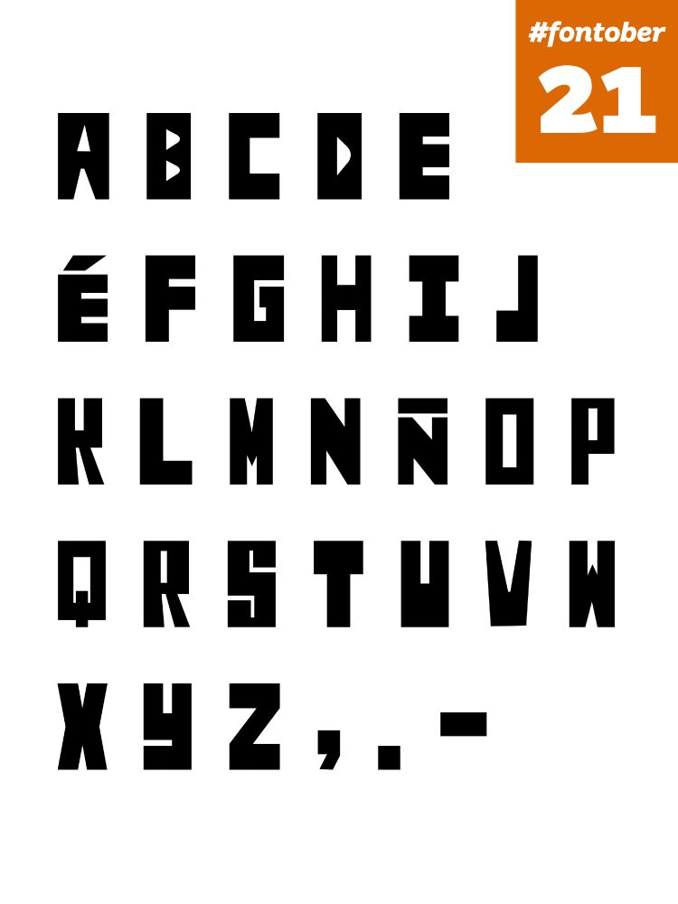
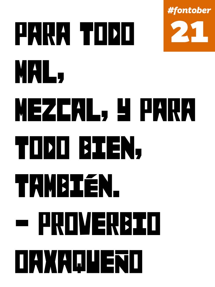
#fontober day 21: this font's based on the lovely hand-painted sign at El Chavo Supermercado by 29th & Mission in SF — boxy, angular, inconsistent, alive! it reminds me of paper cutouts. i wonder what the painting process was — mask off the bounding rectangle and counters and roller-paint the rest?

October 21, 2025 at 8:11 PM
#fontober day 21: this font's based on the lovely hand-painted sign at El Chavo Supermercado by 29th & Mission in SF — boxy, angular, inconsistent, alive! it reminds me of paper cutouts. i wonder what the painting process was — mask off the bounding rectangle and counters and roller-paint the rest?
#fontober day 20: finished the script face from yesterday. it's nice to have an easy day! not sure about that v/w tho, one day i'll learn to draw them properly. also check out that wavy em dash hell yeah


October 20, 2025 at 6:08 PM
#fontober day 20: finished the script face from yesterday. it's nice to have an easy day! not sure about that v/w tho, one day i'll learn to draw them properly. also check out that wavy em dash hell yeah
#fontober day 19: i'm feeling a little under the weather so i was only able to get part of an alphabet done, a cursive script based on some doodles i did with a pressure-sensitive pen in Procreate. i think it shows promise! hopefully i can finish it tomorrow


October 19, 2025 at 10:43 PM
#fontober day 19: i'm feeling a little under the weather so i was only able to get part of an alphabet done, a cursive script based on some doodles i did with a pressure-sensitive pen in Procreate. i think it shows promise! hopefully i can finish it tomorrow
#fontober day 18: sketched a scripty italic. this one might benefit from more iteration because it's hard to get the color consistent across letters with lots of hooks (m n u) and letters with open spaces (c r). the curly d i drew didn't work out, sadly


October 18, 2025 at 8:15 PM
#fontober day 18: sketched a scripty italic. this one might benefit from more iteration because it's hard to get the color consistent across letters with lots of hooks (m n u) and letters with open spaces (c r). the curly d i drew didn't work out, sadly
#fontober day 17: i drew a wide uppercase to complement the lowercase from day 6, inspired in part by the painted town names along the ceiling of the SF ferry building (though my serifs aren't nearly as extravagant)


October 17, 2025 at 10:32 PM
#fontober day 17: i drew a wide uppercase to complement the lowercase from day 6, inspired in part by the painted town names along the ceiling of the SF ferry building (though my serifs aren't nearly as extravagant)
#fontober day 16 (halfway point woooooo): sketched a somewhat unhinged black unicase where all the letters are the same height. the 'a' started as an upside-down 'g' — not sure i've ever done that before!


October 16, 2025 at 8:21 PM
#fontober day 16 (halfway point woooooo): sketched a somewhat unhinged black unicase where all the letters are the same height. the 'a' started as an upside-down 'g' — not sure i've ever done that before!
#fontober day 15: i spotted this hand-painted sign at Librería Palabra de Dios in SF (palabradediossf.com) and fell in love with the funky R sticking its leg out like it's trying to trip somebody. the sign only has 14 letters of the alphabet so i had to extrapolate quite a bit


October 15, 2025 at 7:02 PM
#fontober day 15: i spotted this hand-painted sign at Librería Palabra de Dios in SF (palabradediossf.com) and fell in love with the funky R sticking its leg out like it's trying to trip somebody. the sign only has 14 letters of the alphabet so i had to extrapolate quite a bit
#fontober day 14: today's idea is a geometric slab serif italic, where the stems are tilted but everything else is kept (more or less) straight, including the serifs and rounds. spacing is tough!


October 14, 2025 at 7:31 PM
#fontober day 14: today's idea is a geometric slab serif italic, where the stems are tilted but everything else is kept (more or less) straight, including the serifs and rounds. spacing is tough!
Reposted by chris willmore
Man
I am about to go for the longest walk. Heartbreaking. balleralert.com/profiles/blo...

D’Angelo Dead At 51 After Battle With Pancreatic Cancer
Neo-soul legend D’Angelo has died after a private battle with pancreatic cancer. Read Baller Alert’s exclusive report celebrating his life, music, and impact.
balleralert.com
October 14, 2025 at 3:55 PM
Man